• Skip to main content

Premium WordPress Themes

  • Genesis Pro
  • Blocks
  • Custom Blocks
  • Framework
  • Themes
  • Hosting
  • Agencies
  • My StudioPress
← Go back to StudioPress Blog

Theme Releases

Meet Metro 1.0, Taking Magazine-Style Mobile Responsive Themes Widescreen

Brian Gardner on January 29, 2013

I’m pleased to introduce you to our newest theme from the hardworking team here at StudioPress… the Metro 1.0 theme.

Metro Responsive Theme

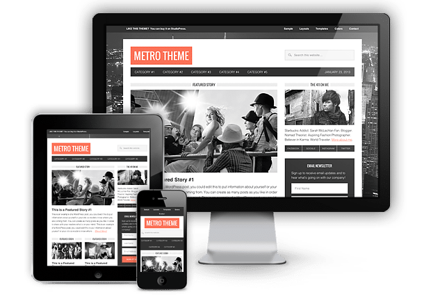
This mobile-responsive WordPress theme is built on the Genesis Framework and can be downloaded by Pro Plus members by logging into my.studiopress.com. If you aren’t already a StudioPress customer you can find it here.

If you want a more detailed description of Metro’s design and features, I did a short write up about the theme for you over on Copyblogger today.

The Metro theme is the 22nd mobile responsive design we’ve developed at StudioPress. You can see a full selection of all of our responsive themes for WordPress here.

Theme Features

With an unprecedented 1152 pixel-wide content frame and magazine-style design, Metro theme sports the following out-of-the-box features: 6 layout options, 5 color styles, 3 story locations, fixed width, mobile responsive, after-post footer widget, landing page template, custom background.

Click here to take Metro theme for a test drive.

About Brian Gardner

Designer. Founder of StudioPress. Creator of Frost.
Connect with him on LinkedIn or follow him on Twitter.

Footer

© 2022 WPEngine, Inc.

Products
  • Genesis Pro
  • Blocks
  • Custom Blocks
  • Framework
  • Themes
  • Hosting
  • Agencies
Company
  • Brand Assets
  • Terms of Service
  • Acceptable Use Policy
  • Privacy Policy
  • Refund Policy
  • Contact Us
Community
  • Find Developers
  • Forums
  • Facebook Group
  • #GenesisWP
  • Showcase
Resources
  • StudioPress Blog
  • Help & Documentation
  • FAQs
  • Code Snippets
  • Affiliates
Connect
  • StudioPress Live
  • Facebook
  • Twitter
  • Dribbble